Now a days custom checkbox styles are part of every design, while it’s an enhancement over native element it possess challenge if implementation goes wrong. Not only keyboard users, screen readers and even mouse users will face problem while filling up forms.
Key Consideration
Developing custom checkbox and make it easy to use, do consider these points:
- Must be accessible
- Perfectly aligned to label
- Preventing text selection
- Focus styles
- Labels are associated with inputs
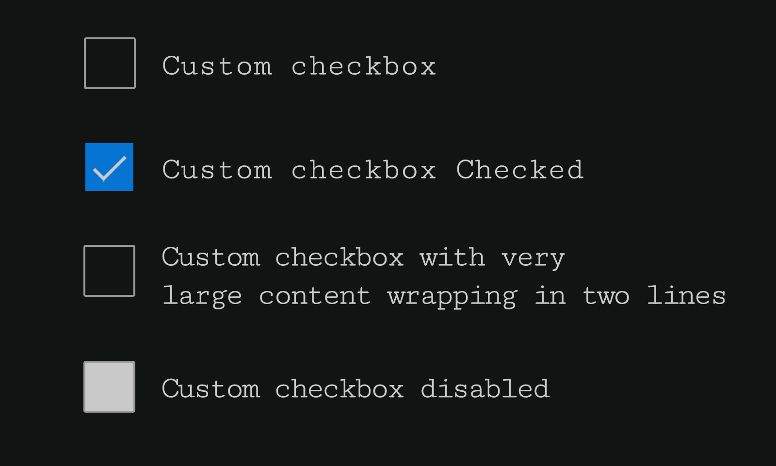
Let’s look at sample design consist of various custom checkboxes, this is pretty much we are gonna build and implementing above points.
Checkbox HTML
Basic markup of single checkbox is pretty much straight forward, input[type="checkbox"] followed by label, and input id is associated with label for attribute using same value. This is all we need in terms of markup.
HTML code snippet
  <div class="checkbox-row">
    <input type="checkbox" name="checkbox_default" id="checkbox_one" class="checkbox" />
    <label for="checkbox_one">Checkbox Default</label>
  </div>
Checkbox CSS
Here we see what modern CSS can do, let’s go step by step while creating custom checkbox:
Step 1:
Visually hide input[type=checkbox] using position:absolute property. Then take it off screen and using left/right properties.
  .checkbox {
    position: absolute;
    left: -99999px;
    right: auto;
  }
Step 2:
Create new element using + adjacent sibling and ::before pseudo properties. Combine checkbox class and pseudo <label> element.
  .checkbox + label::before {
    content: "";
    width: 28px;
    height: 28px;
    position: absolute;
    left: 0;
    top: 0;
    border: 2px solid #000;
  }
Step 3:
At his stage new element is created but things are scattered over places, as label element needs to styled. Align label horizontally and vertically using display:flex properties and adding cursor property as well.
Note: Here
user-select:noneis an important aspect, as it will prevent label text selection on check/un-check of checkbox. This is very annoying and leads to accessibility issues.
  label {
    display: flex;
    align-items: center;
    cursor: pointer;
    padding-left: 46px;
    position: relative;
    min-height: 32px;
    user-select: none;
  }
Step 4:
At this last step, tick mark is created using border and transition properties on pseudo element ::after. Tick mark visibility is managed by opacity. And then add background-color and border-color to highlight selection.
  .checkbox:checked + label::after {
    content: "";
    width: 6px;
    height: 14px;
    position: absolute;
    top: 6px;
    left: 13px;
    border: 2px solid;
    border-left: 0;
    border-top: 0;
    opacity: 0;
    transform: rotate(45deg);
    transition: opacity 0.2s ease-in-out;
    color: #fff;
  }
  .checkbox:checked + label::after {
    opacity: 1;
  }
  .checkbox:checked + label::before {
    background: #0f70d2;
    border-color: #0f70d2;
  }
Focus style
Now custom checkboxes are build, let’s add focus style. It is important as we hide native checkbox which by default has focus. Here similar to step 2, outline styling will be added.
  .checkbox:focus + label::before {
    outline: 2px solid #f5bc0e;
    outline-offset: 4px;
  }
That’s it, we have developed custom checkboxes and implemented key points mentioned earlier in post. Final code with output can be seen in codesandbox.
Codesandbox
https://codesandbox.io/s/custom-accessible-checkbox-tpih1?codemirror=1
Conclusion
While there are other ways to do it as well, such as use of image/svg etc… You can find many articles explaining it very well, at the end it’s your choice which works better for you.
Important: Do not wrap
inputelement insidelabeland avoid puttinglabelbefore input element, as it will cause issue in screen readers such as NVDA and Jaws. Specially when error messages are implemented it will create problem using assistive technologies. So stick toinputthenlabelstructure.